With the Top 10 (Other) Best Rebrands & Refreshes
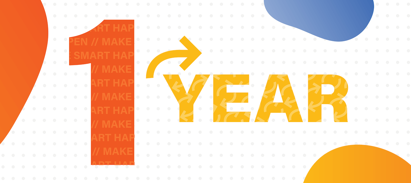
We can’t believe we’re already celebrating the one-year anniversary of Strata’s brand refresh. It’s been quite a year (to say the least). But we can honestly say that, with all of the struggles of 2020-2021, our brand refresh wasn’t one of them. If it did anything (and it did a lot), it definitely brought us together, made us more confident, and better showcased our personality, vision, team, and solutions. The brand refresh catapulted Strata into 2020, helping us solidify our style and services, attract new talent, and stay inspired.
When we decided we needed a new look – we had to pick between a full rebrand or a refresh. For us, the answer was easy. A complete rebrand would have required scrapping our identity and starting from scratch, where a refresh allowed us to keep our main identity and strategy intact. Our brand was strong with our current clients and we had a great reputation as problem solvers and solutions experts – so a refresh was perfect for what we needed to do.
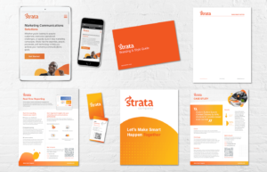
With any rebrand or brand refresh – “consistency across all channels is key”. Over the past year, we’ve ensured that all our materials – from website to print, are on-brand.
Since we now have a bit of rebrand and refresh experience under our belts, we wanted to take a look at the top 10 best company rebrands and refreshes (in our eyes) besides Strata’s, of course.
Our Top 10
Dropbox
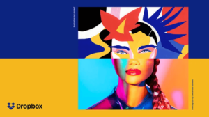
Dropbox refreshed its brand in 2017, and it was nothing short of successful. The company worked with design studio “Collins” to create a cleaner and simpler logo and lots of illustrative elements to better connect with their primarily creative and collaborative audience.
Airbnb
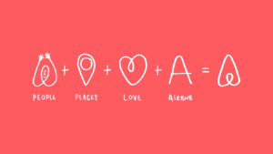
Airbnb did a full rebrand in 2014 with Design Studio, sending their team of designers to 13 cities to truly immerse themselves in Airbnb’s offerings, community, and mission. It resulted in a beautiful brand that differentiated Airbnb from its similar competitors. The CEO of Airbnb even stated, “When I look at this brand, I suddenly realized everything I’ve been trying to say, now we have a way to express it.”
Walmart
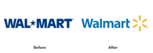
“There are very few companies in the world that managed to change the public perception of their brand as successfully as Walmart did.” In 2008, Walmart made this change to get away from their “always low prices” slogan that often-made customers feel like it was also “always low quality”. They also wanted to steer clear of the questionable corporate practices they were called out for in the early 2000s. So, Walmart did a complete 360 with a whole new brand from redesigned stores to a new look and personality.
Southwest
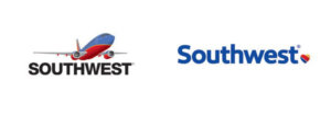
We love this brand refresh because it reminds us of ours. Without a complete overhaul, Southwest changed its look and logo to showcase their humanity and heart – literally.
Guinness
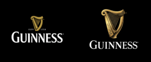
Good old Guinness. Many love it, others don’t, but it always holds true that Guinness makes us feel like we’re back in the olden days, sipping a brew in the pub. Instead of following the crowd of flat logo designs, Guinness actually added detail to its logo in 2016, working “with real harp makers to breathe new life into the legendary logo” that “could be built into an actual harp that would work properly and be in tune.”
Starbucks
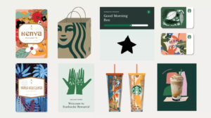
Starbucks is loved by many – and dare we say it – is mainly successful because of its brand (although we do love it a latte). They’ve made slight changes over time to the brand, always increasing their user experience and recognizability with a “distinctive color scheme, typography, and illustrations.”
Taco Bell
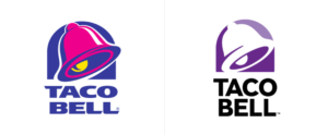
You may not have really noticed Taco Bell’s brand refresh until now – but its cleaner, simpler look has helped it stay relevant among its many fast food and taco chain competitors. Along with this well-done refresh, Taco Bell has been named “one of the healthiest fast-food chains in America,” so, they’re doing quite well.
Mastercard
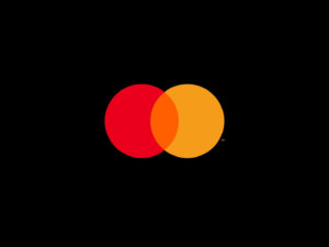
In 2016, Mastercard conducted a refresh with Pentagram to emphasize “simplicity, connectivity and seamlessness.” It’s simple and sleek look of just the famous two overlapping circles is surprising, but logic-based. “The change follows research by Mastercard that found that more than three quarters of people asked were able to identify the brand from the two interlocking circles alone.
Burger King
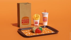
For the first time in 20 years, Burger King conducted a brand refresh with a new logo, uniforms, and packaging – and we love its nostalgic look. The new logo is actually very close to BK’s logo design from the 70s-90s. The creative agency on the project wanted to “pay homage to the brand’s heritage with a refined design that’s confident, simple and fun.”
Intel
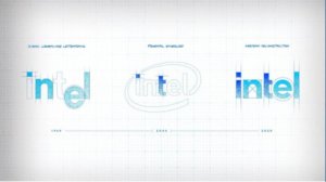
Last but not least, Intel’s 2020 refresh caught our eye because of its subtle hints to past logos. Again, it refers back to their past while being currently relevant. “This new logo includes elements of both (past logos), but in a much more subtle, minimalist way.”
To take a more in-depth look back at our brand refresh, visit our original refresh blog, here. If you’re looking to make your branding and marketing communications more effective and efficient, give Strata a call.
Back to Blog